Here is the soundtrack to Apple, it's basically the first hint that you're going to get to a finished article of the film. Don't say I never do anything for you.
The music generally follows the film with happy music when the apple is traveling safely or excitingly and more tension when it is threatened. The best example of this is when it flies from the bridge and ends up in the cyclists basket.
Monday 16 November 2009
Friday 13 November 2009
The 2nd Ancillary Piece: Magazine Review Page
Here is the Magazine review page which accompanies our short film.
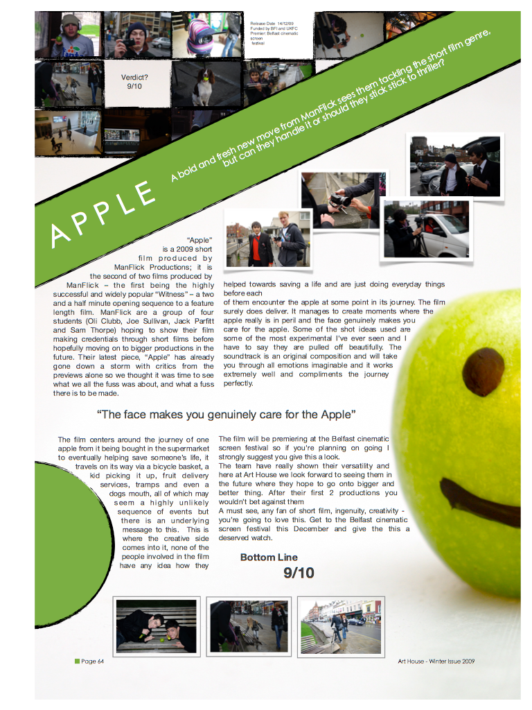
Much like the poster we created the page follows the same colour and font scheme so as to create a brand identity.
We placed the review in Art House magazine because it is more typical of them to print a short film review than a more feature length oriented magazine such as Empire.

Much like the poster we created the page follows the same colour and font scheme so as to create a brand identity.
We placed the review in Art House magazine because it is more typical of them to print a short film review than a more feature length oriented magazine such as Empire.
Saturday 7 November 2009
The Official Apple Film Poster
Our poster is now complete and we've decided to go with a basic and simple design for it.
We advertised the film as showing at a short film festival because to advertise it as a cinema blockbuster is just not in keeping with the genre.
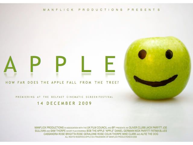
We figured that keeping the same kind of colour scheme and font throughout all of our pieces would help to create a brand identity and so all of the text is in the same green colour and the fonts are all similar too.
We also came up with the tagline "How far does the apple fall from the tree?" because it is a very well known phrase. However it also a hint at the journey the apple travels on.
Friday 6 November 2009
Ancillary Task Research: Posters
Before we create our poster, I'm doing some research into general layouts for short film posters.
Below is a poster for "A Deadly Silence", a short horror.

It is a simple design which, like a horror film, doesn't give too much away. We can see a silhouette of a man with a knife helping someone up from the floor, indicating the chance of murder within the film.
The colour scheme is also typical of the horror genre in that it is dark with scarlet writing for the title of the film. This generally links to the darkness in many of the locations, with the red connoting the likelihood of bloodshed.
It also tells the viewer where the film will be screened and when, this is key given the niche market of short films.
The next poster is for a Paraguayan short film called Guantes Blancos. Whilst I myself don't speak Spanish, the poster itself is very eye catching despite a basic colour scheme.
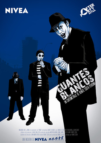
The illustrations of people have been turned into silhouettes and as such look menacing and as if they are in some kind of gang. I like this poster because even though I can't read it, it's images give me a gist of the film, it is universally accessible.
The next poster I have chosen is not from a short film, however it is so iconic and close to our initial ideas that I have to mention it. The poster is from Quentin Tarantino's first film, Reservoir Dogs.

The design is basic, showing just the main characters walking along dressed in matching suits, the title, the tagline, and the director. As I said before, this was Tarantino's first movie and so he had no credit to his name and therfore there are no critics quotes and no other details, the focus is on the film itself.
We will be following this idea with a basic scheme of our own, just the apple, the tagline and where to see the film.
Below is a poster for "A Deadly Silence", a short horror.
It is a simple design which, like a horror film, doesn't give too much away. We can see a silhouette of a man with a knife helping someone up from the floor, indicating the chance of murder within the film.
The colour scheme is also typical of the horror genre in that it is dark with scarlet writing for the title of the film. This generally links to the darkness in many of the locations, with the red connoting the likelihood of bloodshed.
It also tells the viewer where the film will be screened and when, this is key given the niche market of short films.
The next poster is for a Paraguayan short film called Guantes Blancos. Whilst I myself don't speak Spanish, the poster itself is very eye catching despite a basic colour scheme.
The illustrations of people have been turned into silhouettes and as such look menacing and as if they are in some kind of gang. I like this poster because even though I can't read it, it's images give me a gist of the film, it is universally accessible.
The next poster I have chosen is not from a short film, however it is so iconic and close to our initial ideas that I have to mention it. The poster is from Quentin Tarantino's first film, Reservoir Dogs.
We will be following this idea with a basic scheme of our own, just the apple, the tagline and where to see the film.
Thursday 5 November 2009
The 5th ManFlick Podcast
In this Podcast we talk about how we've corrected our issues and have now finished filming.
Sunday 1 November 2009
First Poll Returns
After handing in our first draft we have been given a list of thing to ammend in Apple.
- More focus on the apple itself as opposed to those transporting it (POV shots, close ups, etc.)
- Light discrepancies to fix.
- Wet floor discrepancies to fix.
These aren't major tasks so we should get them done soon and be able to move on to our ancillary tasks.
Subscribe to:
Posts (Atom)


