Below is a poster for "A Deadly Silence", a short horror.

It is a simple design which, like a horror film, doesn't give too much away. We can see a silhouette of a man with a knife helping someone up from the floor, indicating the chance of murder within the film.
The colour scheme is also typical of the horror genre in that it is dark with scarlet writing for the title of the film. This generally links to the darkness in many of the locations, with the red connoting the likelihood of bloodshed.
It also tells the viewer where the film will be screened and when, this is key given the niche market of short films.
The next poster is for a Paraguayan short film called Guantes Blancos. Whilst I myself don't speak Spanish, the poster itself is very eye catching despite a basic colour scheme.
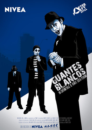
The illustrations of people have been turned into silhouettes and as such look menacing and as if they are in some kind of gang. I like this poster because even though I can't read it, it's images give me a gist of the film, it is universally accessible.
The next poster I have chosen is not from a short film, however it is so iconic and close to our initial ideas that I have to mention it. The poster is from Quentin Tarantino's first film, Reservoir Dogs.

We will be following this idea with a basic scheme of our own, just the apple, the tagline and where to see the film.


No comments:
Post a Comment